Strut cards design advice
What goes into a great strut card design? It’s all about artwork that looks incredible and communicates effectively with your ideal customer. Here’s just a selection of our top strut card design tips…
#1: Less is more
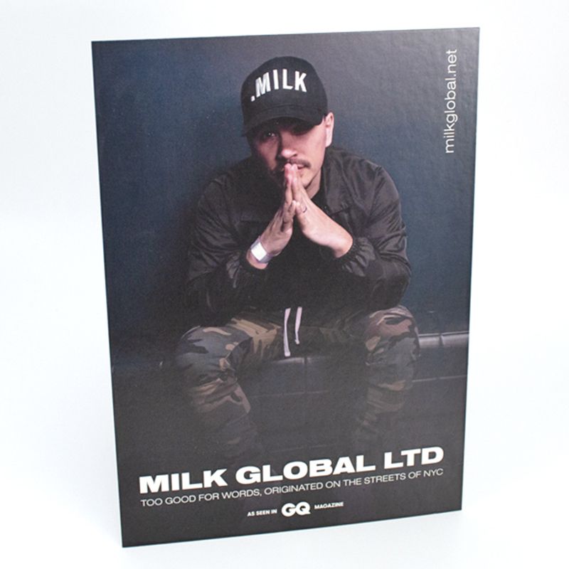
Don’t overload your showcard stand design with garish, cluttered visuals and walls of text. Your display card design should be readable and appealing, even from a distance.
Keep your message lean and succinct. A few well-chosen words in big, eye-catching typography will speak volumes; in a way a small essay never will.
Make sure your message drives the reader to take the action you want – which means clearly presenting the value of that action to the reader. Why should they do what you’re asking? What’s in it for them?
Stick to two or three main colours, with four as an absolute maximum – and keep graphics and shapes to a minimum. Depending on the content and goal of your message, sometimes a plain background and a few words of text is all it takes to command the customer’s attention.

#2: Be consistent
Your strut card artwork needs to work together as a whole, while also keeping in line with your other marketing communications and visual branding.
Any discrepancies between different elements can be distracting; preventing the card’s key message from really sinking in with the reader.
Does the content and tone of the text match with the graphics you’ve created? For bonus points, it’s great to play your message off your visuals or vice/versa; perhaps pairing a piece of word play with an appropriate visual metaphor or sight gag.
Do your colour choices work together, or against each other? Spending half an hour researching colour theory can help you choose colour combinations which harmonise or contrast effectively with one another.
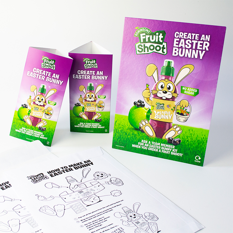
Design consistency is especially important if you’re using variable data printing or printing multiple versions of the same design. Make sure each variant’s unique elements look and feel like a natural part of your base artwork.

#3: Make your design unique
For maximum visual impact with your display cards, make sure there’s something about your print design which sets it apart from the competition.
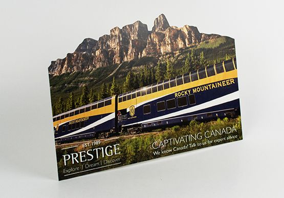
For example, why not customise your print run with one of our shape options – or better yet, your own bespoke die-cut shape?
Here’s another suggestion; instead of the typical portrait strut card format, why not order super-wide landscape cards with multiple support struts at the back? It’s something a little bit different to help you capture the customer’s focus – plus it offers a unique opportunity for more creative, visually-arresting artwork.

